One of the most important lessons I’ve learned in turning the page to this new chapter of my life, is that it helps to claim ownership of things. This is true of my new cookware, my new wireless earbuds, and my health. Discovering my decorating style and claiming the bathroom space as my own – marking my territory, if you will – served the same purpose.
Revamping the bathroom was one of the first projects I took on after creating my Memory List. I knew I was going to enjoy the new towels and a fresh coat of paint, but I had no idea how amazing it was going to feel.
When it came to towel shopping, I wanted to treat myself. I wanted luxurious ones. You know, the soft, plush kind that aren’t scratchy when you dry off. I did extensive research, meticulously reading customer reviews.
Once I settled on a brand (Wamsutta, for those interested), only then did I consider color. This was definitely a case of function over form. Color theory is something I learned about when I taught myself web design. There’s a theory for picking a good color palette, and the color wheel is a gorgeous and wonderful design tool to help with that, and I’m not just saying that because it’s a rainbow.

But what color to choose?
Yellow is my favorite color. It’s bright, lively, and makes me think of sunshine. It’s also the color of my favorite Care Bear: Funshine Bear. So, obviously, yellow is a strong contender.
In the past year or so, green has been finding its way closer to my heart. I like its vibrance, and how it reminds me of Spring rebirth. The rebirth theme certainly resonates with me, given what I’m going through.
I’ve added a bunch of new red t-shirts to my wardrobe. Maybe red should get a chance. My gut says it’s too bold, too energetic, too aggressive, though. Especially for a small bathroom. Red will have to remain a solid shirt color for now.
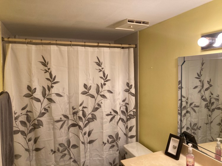
Then I threw a wrench in my towel-color-choosing gears. I started considering the color of the walls. A colorful towel would mean that I’d have to find a complementary paint color, and I worried that would make the room feel smaller. I didn’t want that. I wanted the opposite; I wanted the bathroom to feel bigger, airier, lighter. My aha moment: I wanted the walls to be yellow.
Opposite yellow on the color wheel is violet. Purple and yellow will always have a place in my heart. They were my wedding colors, each of our favorites. Because of that, though, I had to choose something different. I needed to allow my yellow to have its time in the spotlight, without being dependent on anything else. And for that reason, grey works well as a silent partner for pretty much any color.
With that decision, I ordered my towels. When they were delivered, I took one of the hand towels with me to my local home improvement store and shopped for paint. There I was in front of the rainbow of swatches, picking out the yellowy ones, looking for that perfect golden hue. Once I found my top two choices, I got the opinion of the friendly staff member behind the paint-splotched counter. Thankfully, she chose the same one I was leaning towards.
I’m kicking myself for not taking a before photo of the bathroom, because the transformation was incredible. The walls were an ugly brown, the white trim was dingy, and the ceiling was stained. The bath mat was old and worn out. The shower curtain was too noisy for me, with its abstract turquoise flowers.
I changed it all, seeking a more modern, elegant style. I think I achieved that, and I’m super pleased with the final result. Now I enjoy spending time in my bathroom 🙂