I’m sure there are folks who believe that a brownish beige color looks good on walls. I am not one of those people. I prefer livelier colors. I want to feel more invigorated when I’m in a room, and brown hues have the opposite effect; the drabness seems to suck the energy from me.
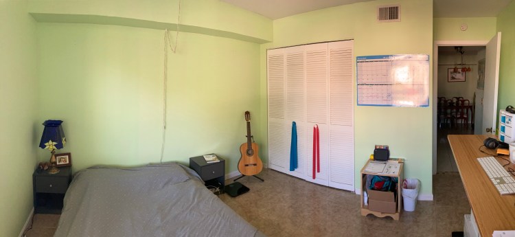
This beige color, over-excitedly painted in spots on the baseboards and ceiling, was what I had been looking at, day in and day out, in my current office/bedroom. (Soon, this room will only serve as my office, and maybe a place for guests, when I take over the rest of the apartment and can have a dedicated bedroom.) I hated the color.

The photo shows it in a nicer light. It certainly wasn’t that bright. What you see is the gorgeous, Florida sunshine coming in through the window, making it seem cheerier.
I needed a new splash of color. So, here we go again! I had recently gone through my color preferences when I revamped my bathroom. I was pretty sure I was going to opt for something in the greens this time around, as the color was a close runner-up the last time I went paint-shopping.
But, oh. What shade of green? More towards the yellow of the spectrum, or to the blue?

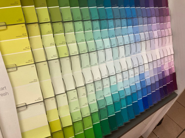
I find it extraordinarily soothing to browse paint swatches. Granted, I’d enjoy it more if I wasn’t breathing through a mask, and perpetually aware of how close other people are to me in the aisle. Regardless, I like getting lost in the sea of gradient color, a rainbow wall.
I slowly scan the different hues, waiting for one to call out to me. #569 – Nottingham Green caught my eye first. It was light green, even in its yellow and blue tones. I felt a sense of calm blanket me. I hold onto that one. Then I see #555, with a bit more yellow, but still solidly a light green shade. O’Reilly Green, you’re a contender, too.
I hold each of them against a blank, white background. I like both of them. I’m sure I’ll like whichever one I choose. I feel myself leaning more towards the Nottingham option, when the staff member behind the paint counter said, “We have more colors over there,” pointing to the back of the aisle.
Another wall of swatches! Similar, obviously, but a new brand of paint brings new possibilities. I found the greens and scanned again. I picked out the first swatch I heard say “Pick me!” and held it against the white display wall. The middle one in the swatch looked the best to me, and then I looked at its name: 26D-2U – Isla Mujeres.
I giggle silently behind my mask at the Universe’s sense of humor. Even with the pocito Spanish I know, I can translate Isla Mujeres to “Women Island”. Um, yeah. I would be very happy to go to work each day on an island of women.
Thank you, Universe. You helped me make a great choice, and I love the end result!


